Project
Purovitalis
Role
Tools
Figma, WooCommerce (WordPress / Elementor), Clarity
Designing a high-converting supplement product page under EU regulatory constraints
Turning regulatory constraints into a conversion advantage
Purovitalis operates in the European supplement market, where strict regulations limit the use of explicit health claims. This creates a unique challenge: how do you build trust and drive conversions when you cannot directly promise results? This case study outlines how the product detail page (PDP) was redesigned to increase conversion rates by shifting from claim-driven marketing to trust-driven UX. • EU regulations restrict strong claims about supplement effectiveness. • Competitors (especially US brands) use aggressive marketing language. • Users are skeptical and require higher trust signals to convert.

Problem
Business:
Strong claims are restricted under EU law
Competitors use more aggressive messaging
Lower perceived effectiveness impacts conversion
User:
Unclear product benefits
High skepticism toward supplements
Decision hesitation due to weak differentiation
Impact:
Low add-to-cart rate
High bounce on PDP
Users leaving to validate claims elsewhere
Analysis / Approach
Key insight:
Removing claims creates a trust gap — but that gap can be filled with transparency and structure.
Research highlights:
Users scan for proof: ingredients, origin, reviews
Scientific content is valued but often too complex
EU competitors are compliant but feel unconvincing
Strategy — shift from persuasion to confidence-building UX through:
Trust over claims
Clarity over persuasion
Structure over density
Guidance over overwhelm

Solution
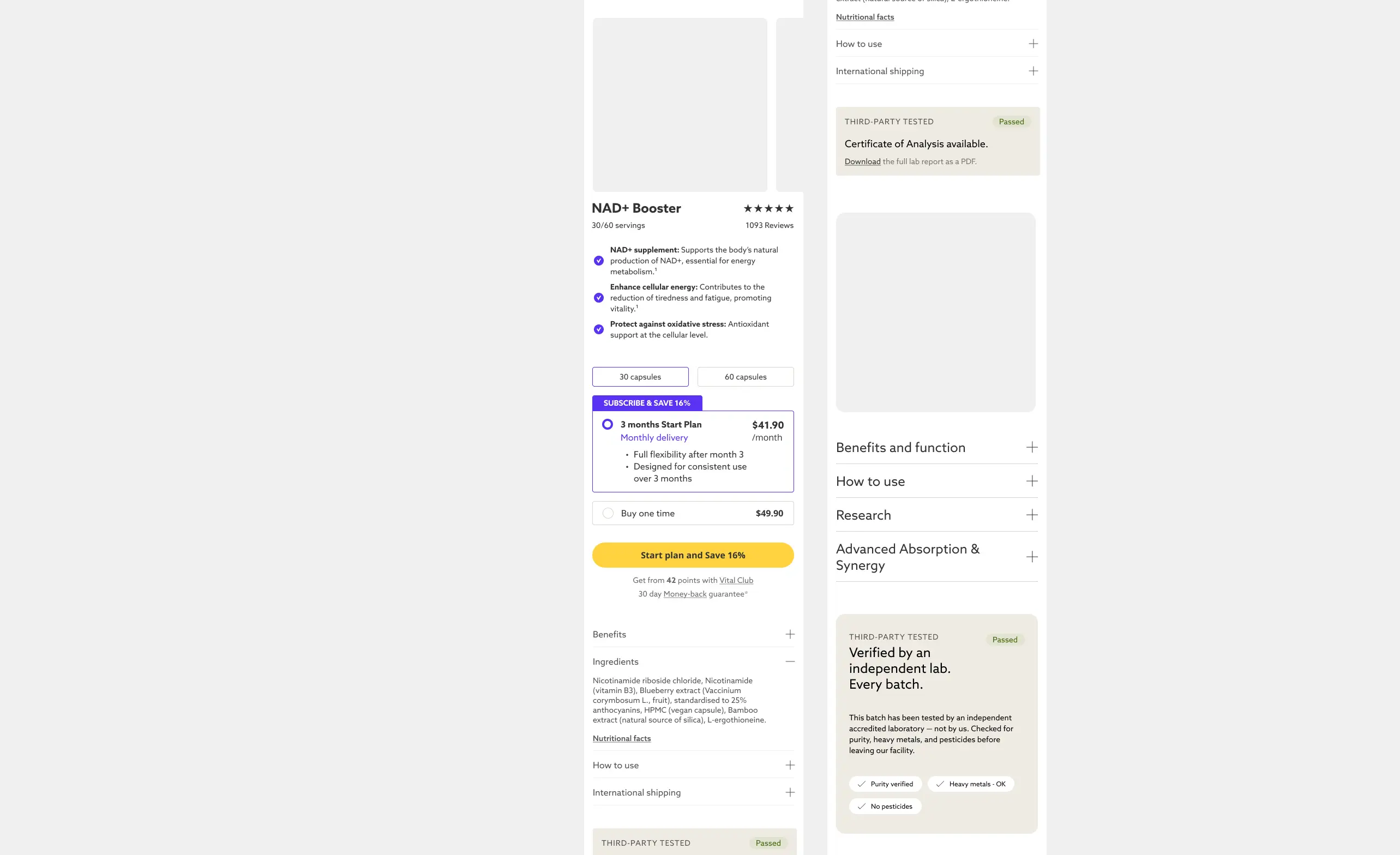
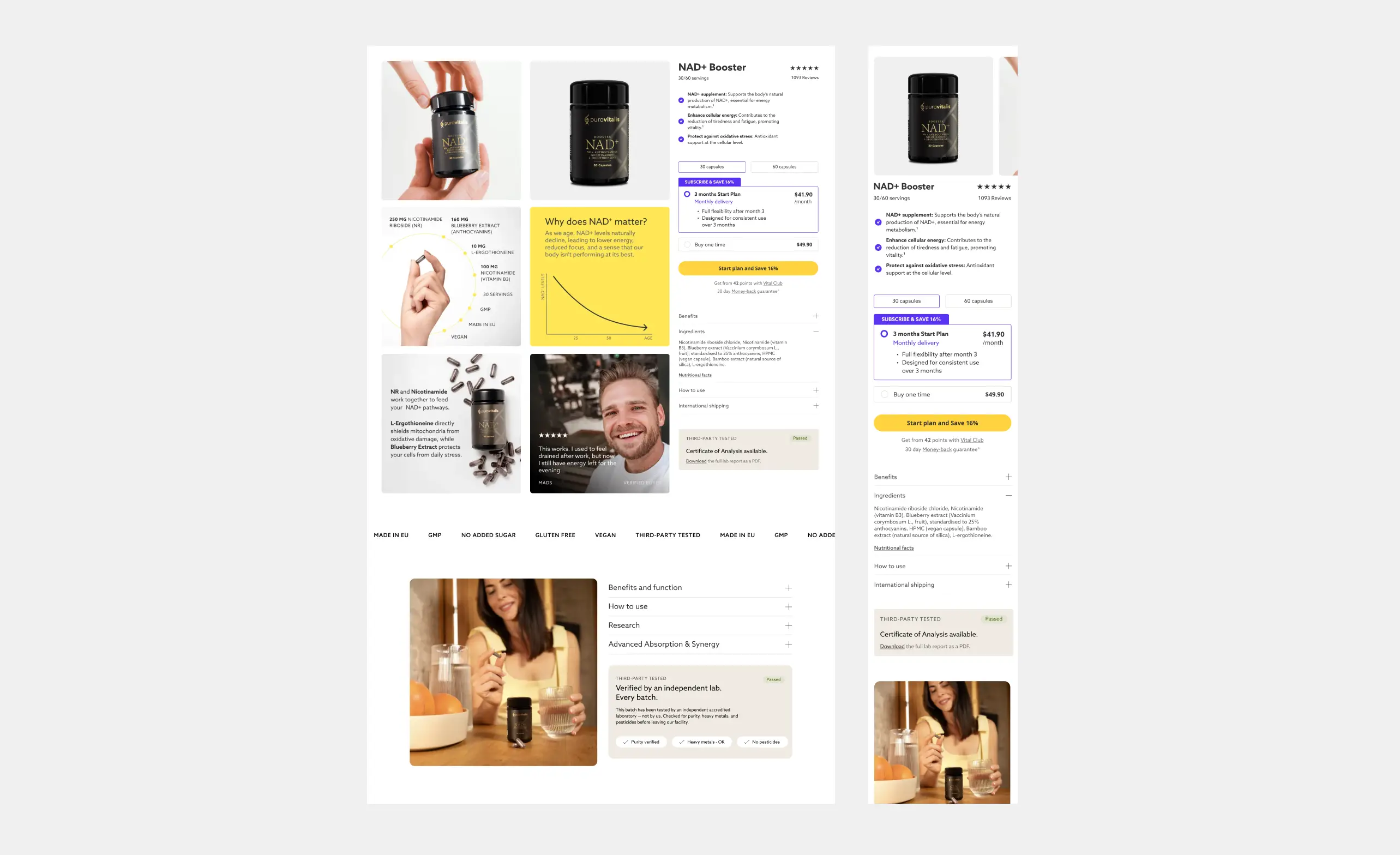
1. Above-the-fold restructuring
The entry point was redesigned to answer three questions immediately: what the product is, who it’s for, and why it can be trusted. Clear positioning and compliant benefit framing were paired with visible trust signals such as quality standards, origin, and testing to reduce early drop-off and anchor credibility from the first screen.
2. Trust without claims
With explicit claims restricted, the page shifted to evidence-led communication. Ingredient transparency, sourcing details, and certifications were surfaced and contextualized, while scientific references were simplified to be readable without losing rigor.
Principle: show evidence, not promises
3. Simplified science UX
Scientific content was restructured into digestible blocks with a strong visual hierarchy. Plain-language summaries guide scanning users, while deeper layers remain available for those seeking detail, increasing engagement without overwhelming.
4. Decision-support sections
To reduce hesitation, the page introduced guidance elements such as “who is this for,” clear usage expectations, and concise differentiation. These sections help users self-qualify quickly and move forward with confidence.
5. Social proof placement
Reviews were repositioned closer to decision points and framed for authenticity rather than volume. This leverages peer validation at the exact moments users question credibility.
6. Improved information hierarchy
Content was reorganized into a scannable flow—value → trust → education → proof → action—so users can progress naturally from understanding to decision without friction.
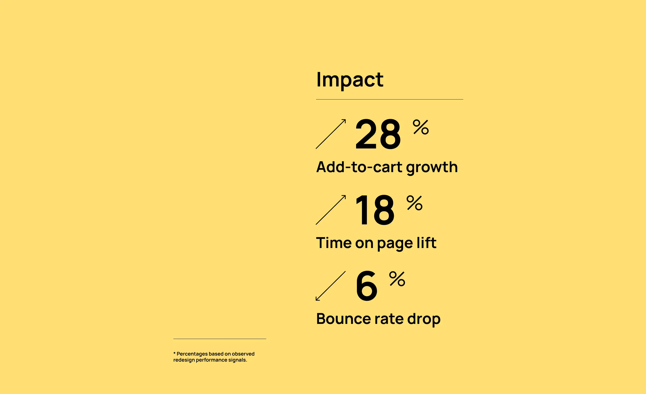
Results
+28% add-to-cart rate
+18% time on page
-6% bounce rate
Qualitative impact
Increased perceived trust
Fewer pre-purchase doubts
Stronger brand credibility
Final reflection
Designing within strict regulatory constraints forced a shift from persuasion to confidence-building. Instead of relying on claims, the solution focused on structuring information, increasing transparency, and guiding users toward informed decisions. This approach not only improved conversion but also strengthened long-term trust — turning a limitation into a strategic advantage for both product and brand.
Skills demonstrated: UX strategy, information architecture, constraint-driven design, e-commerce optimization.