Project
Purovitalis
Role
Tools
Figma, Plausible Analytics, Heatmaps, Customer Surveys
Redesigning the Homepage to build trust, improve discovery, and guide different customer journeys

Balancing education, trust, and conversion in a regulated supplement market
As the primary entry point to the brand, the Purovitalis homepage had to serve multiple audiences while operating within the constraints of the European supplement industry. Although the site offered a wide range of longevity-focused products, early research revealed that many visitors struggled to understand what the company sold and why they should trust it. The redesign focused on repositioning the homepage as a trust-building and discovery tool. Rather than pushing users toward an immediate purchase, the goal was to help them understand the brand, explore relevant products, and confidently continue their journey.

Problem
Business
High bounce rate on the homepage
Weak trust signals for first-time visitors
Outdated presentation that no longer reflected the brand
Product variety was not easily discoverable
User
Visitors struggled to understand that the website was an online store
Scientific credibility was not visible early enough
Returning customers received the same experience as first-time visitors
Product discovery required too much effort
Impact
Users left before exploring products
Valuable educational and product content remained unseen
The homepage failed to support different customer intentions effectively
Analysis / Approach
Key insight
Visitors were not leaving because of a lack of information—they were leaving because they lacked confidence in what Purovitalis was and where to go next.
Research highlights
Research combined quantitative and qualitative inputs, including Plausible analytics, heatmaps, customer support feedback, competitor analysis, surveys, and moderated homepage reviews.
The most important finding came from first-time visitors. During testing, both participants struggled to identify that Purovitalis was an e-commerce store from the first screen. At the same time, analytics and behavioral data suggested that trust-building content and product discovery opportunities were not receiving enough visibility.
Strategy
The redesign focused on three objectives:
Establish credibility immediately
Improve product discovery through clearer navigation paths
Create tailored experiences for new and returning visitors

Solution
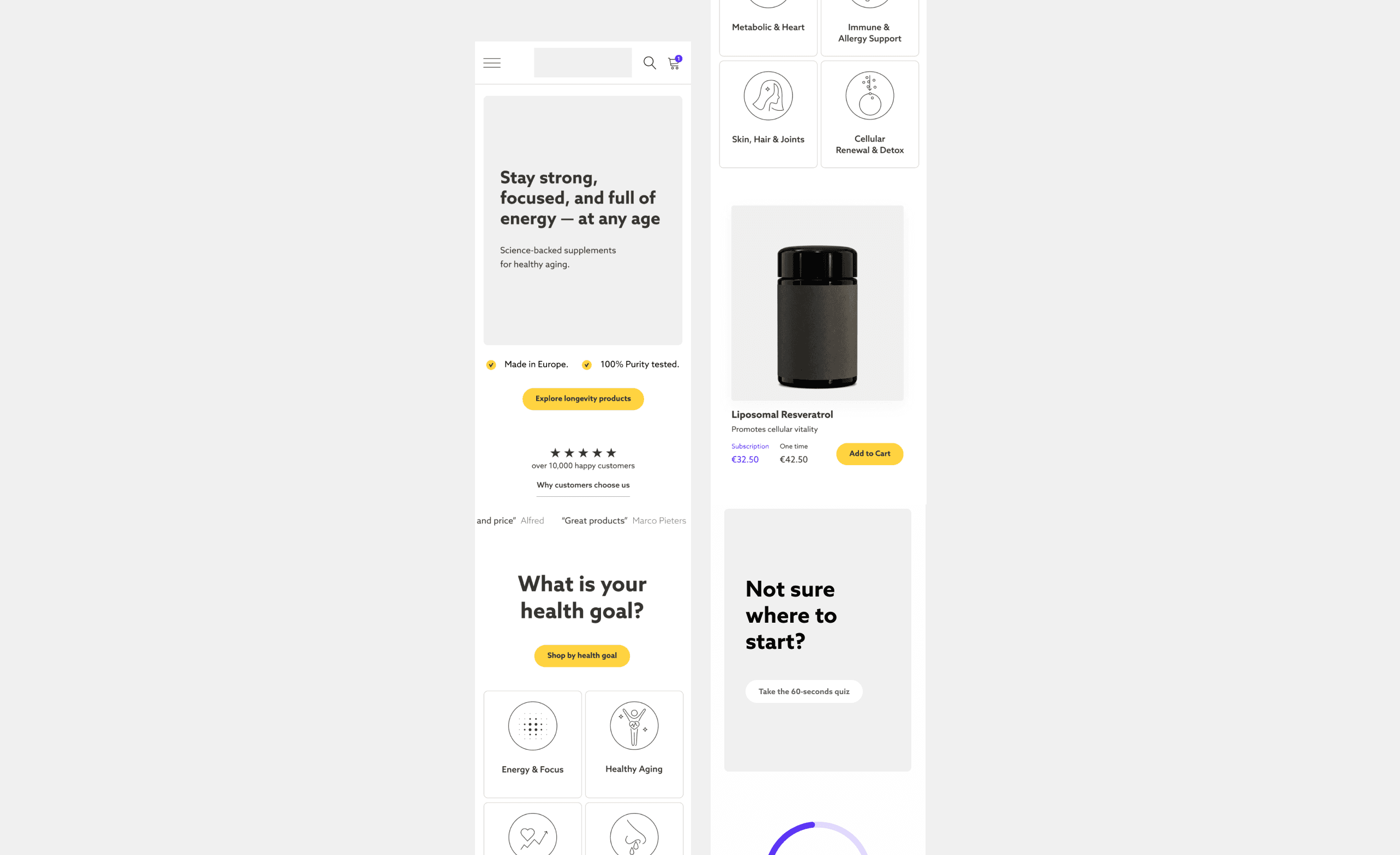
1. Audience-specific hero experience
The homepage hero was redesigned to support two distinct user journeys. First-time visitors were introduced to the brand through credibility-focused messaging designed to communicate trust and expertise. Returning customers were presented with subscription-related content and quicker access to products, creating a more relevant and personalized experience.
2. Trust-first content hierarchy
Trust-building elements were moved significantly higher on the page. Customer reviews now appear directly after the hero section, reinforcing credibility before users are asked to explore products. This creates an immediate layer of social proof and reduces uncertainty early in the journey.
3. Product category-led discovery
One of the biggest structural changes was introducing dedicated product categories near the top of the homepage. Instead of requiring users to scroll through featured products to understand the assortment, visitors can immediately identify relevant product groups and navigate according to their goals.
4. Guided product exploration
Featured products remain an important part of the experience but are now supported by a guided discovery path. A dedicated quiz call-to-action helps users identify suitable products based on their needs, reducing decision fatigue and improving confidence during exploration.
5. Visible trust and credibility signals
To strengthen scientific credibility without relying on aggressive health claims, dedicated trust sections were introduced throughout the page. Customer outcome data, product quality indicators, and evidence-based messaging help communicate expertise while remaining compliant with EU regulations.
6. Simplified homepage flow
The homepage was restructured around a clearer progression: credibility → social proof → discovery → products → trust → education → action. This creates a more intuitive journey and ensures users encounter the right information at the right moment.
Results
Increased session duration
Improved scroll depth and page engagement
Growth in subscription signups
Higher visibility of product categories and featured products
Qualitative impact
Stronger first impression for new visitors
Improved understanding of what Purovitalis offers
Better alignment between educational content and commercial goals
More personalized experience for returning customers


Final reflection
The redesign demonstrated that homepage performance is not driven by conversion tactics alone. By focusing on trust, clarity, and discovery, the homepage became a more effective entry point for both new and returning visitors. The introduction of audience-specific experiences and clearer product pathways transformed the homepage from a content-heavy landing page into a strategic navigation and trust-building tool that better supports long-term customer relationships.
Skills demonstrated: UX strategy, information architecture, CRO, audience segmentation, trust-focused design, e-commerce optimization